


Warning Track Power
-
Posts
3,931 -
Joined
-
Last visited
Content Type
Profiles
Forums
Blogs
Events
News
2026 Milwaukee Brewers Top Prospects Ranking
Milwaukee Brewers Videos
2022 Milwaukee Brewers Draft Picks
Milwaukee Brewers Free Agent & Trade Rumors, Notes, & Tidbits
Guides & Resources
2023 Milwaukee Brewers Draft Picks
2024 Milwaukee Brewers Draft Picks
The Milwaukee Brewers Players Project
2025 Milwaukee Brewers Draft Pick Tracker
2026 Milwaukee Brewers Draft Tracker: Picks & Bonuses
Store
Downloads
Gallery
Everything posted by Warning Track Power
-
 Wow...I will miss him but not at that salary! Gracious. Come on back Moose!
-
I wonder If they investigated using the arm patch with the ball and sprigs of barley as the seams as the ball in the BiG. Perhaps too much of a departure from the original BiG for most fans to handle but worth asking. For the record, I was on board with questioning the decision to update the BiG but I love what’s has come with all of the logos and uniforms. My only small gripe would be to have put the Barrelman as the arm patch on the cream and pinstripe instead of the barley ball.
-
Absolutely love the uniforms. Easily the best uniforms in this franchise's history. My only gripe at all is the barrel man should be the sleeve patch on the home creams and pinstripe alternate.
-
There it is And it looks like the font is the AmFam Fields of Phoenix font!
-
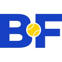
https://twitter.com/BrewCrewBall/status/1196578466931597313/photo/1 Oh boy...are they merging the M with Barley and the BiG? The seams are wheat?
-
Cleaned up version of the original leaked logo presented without comment
-
Right? That's why I said a few posts back that "assuming one (new uniform set) is dropping tonight." Seems so odd that there was no hype leading up to this event whatsoever, especially after this website got wind of the new logo, and McCalvy's article from about a month ago. I would have thought we would have seen some sort of lead-up.
-
If I were to guess the Brewers new uniform set (assuming one is dropping tonight), I am assuming it will look very 80s-like. By this I mean updating/modernizing the Brewers look from that time period, similar to what the Blue Jays did. I anticipate this: *Home Pinstripe (modified version of the retro Friday look) *Away Gray (modified Milwaukee script similar to the beloved 80s away uniform) *Home Cream alternate (replaces the retro Friday uniform) *Away Powder Blue alternate with Royal BiG cap (same script as regular Away, just in powder blue) I think the Retro Friday (royal and yellow) goes away for the most part given how similar it will look to the current "new" pinstripe. I also don't foresee a navy alternate as I think the cream will replace it at home and the powder blue will replace it on the road. Let's cross our fingers they knock it out of the park, create a timeless look and this becomes the last uniform change for the next few generations.
-
Amen to this. I have been one of the more vocal opponents of the change and just seeing this picture makes it look much better and almost indistinguishable to the untrained eye.
-
Unless you are just mad that they changed the logo at all, I don’t see how they can mess this up. Based on what was leaked it seems like they updated their uniforms from. If given the choice, yes I would vote to leave the original logo alone, it is great and no one was asking to change it. But I’m not totally opposed to some tweaks if done well, and understand the tweaks that were made are small. I just think overall, the sum of those tweaks, the end product is just...worse. If you absolutely need to change something, then go ahead and fill in the white webbing and change the seams on the ball, no big deal. I even think there are other changes that probably could’ve been made and still look ok. But the rest of the changes they made creates an end result that just doesn’t look right. The ball is less centered, the whole thing looks oddly skinny and taller. Yeah it’s little things, but the overall effect is just worse. At least to me it is. And that’s especially disappointing when literally doing nothing to the logo would’ve satisfied pretty much everyone. I also really don’t like connecting the bridge between the m and the b. Not only do I think it looks worse, but the old logo was, literally, an “m” and a “b”. We all fondly remember the moment we learned that. Now, while obviously subtle and nitpicky, technically that is no longer true. Sums up my feelings perfectly as well. Great post.
-
After seeing the almost universal backlash against this "updated" version of the logo, I will not be surprised if Attanasio changes it back to the original. He seems too astute to the wants and desires of the fanbase to go with this long term. Like I mentioned previously, this is a Selig/Selig-Prieb move. Attanasio is more in tune with us (at least I hope he is).
-
I’ve been convinced since Spring Training that the American Family Fields of Phoenix walkway leading to the stadium with the retired numbers and the historical wall number will be the Brewers new uniform font. http://ballparkdigest.com/wp-content/uploads/2019/02/AmFanFields2019-4.jpg
-
Here’s a great shot of a side by side from our friend Borchert Field on Twitter
-
Dude, you need a new hobby other than snark on this board. It doesn't add to any conversation. You don't like the BiG. Cool. Instead of being snarky, why don't you offer your actual opinion on what the logo should look like? I was born in 1982 and in no way am living in the past. I just think it's an amazing logo. (Other than the powder blues and the gray Milwaukee script, those uniforms were pretty average though, I'll give you that ).
-
Fixed Fixed again.
-
Fans have been clamoring for a return to the BiG for years and then the Brewers give the fans something they weren't asking for. The original was a classic and the only move that needed to be made (if one needed to be made) was to change to navy instead of royal (and that is debatable). This reminds me of a decision the Selig or Selig-Prieb management team would make, not the Attanasio team. I am surprised about how tone deaf they have been on this decision.
-
can you share how you can? I don’t like to be that guy that says they have a source (as I rarely ever do) but I just know someone connected with the Brewers who shared with me that the mistake was by Topps to release that card before the Brewers were ready to release it themselves. I know nothing else about it other than that. So no uniform news and what I shared isn’t exactly breaking news as most have guessed that the logo is that anyways. Brew4U aka High Heat Just kidding. Thanks for sharing inside information.
-
The Padres are doing good and bad so far from what I can see with their rebrand from the picture below. The good: -Returning to the colors that ARE the Padres (brown and yellow) -The swinging friar is prominent The bad: -Is it the historical brown or is it so dark brown it looks black? This would be bad Now most of this is pure speculation as nothing has been announced but: 1. I wish the Brewers wouldn't have modified the BiG period. The centering of the ball, addition of stitching and connecting the M and the B still feel like tweaks for the sake of tweaks. However, it will be something that we probably won't care about in a year or two. I can deal with it. 2. I would have also preferred the colors return to royal and yellow, as I feel that combination is the Brewers. Royal, while other teams like the Cubs, Dodgers and Royals have them, isn't featured prominently with yellow. It's a unique look to the Brewers (since the Mariners updated their uniforms in the 90s). Navy just isn't exciting to me. Hopefully they keep the royal/yellow as an alternate. Cream should be looked at as an addition given its history in Milwaukee. 3. Much like the Swinging Friar, feature the Barrelman. That is an iconic look for the Brewers and I think they did a great job of updating his look a few years back. Overall, I am excited for the new look and hope they hit it out of the ballpark like the Bucks did with their rebrand.
-
Yes...it feels like the logo has been stretched. If this is the new logo, hopefully the Brewers recognize after a season that they didn't need to modify the ball and glove at all, and return to its original form. Much like the Tigers did a few years back when they enlarged the D on their caps to the extreme and fan outrage made them change after one season.
-
Initial impression is I don’t like the modifications to the logo. Keep the logo the same (in navy or royal) but modify the uniforms. This feels like a tweak for the purposes of a tweak.
-
Oh man...my favorite Brewer uniform of all time. Use the royal and yellow colors, ball and glove and modernize the templates for the uniforms (if you must) and call it a day.
-
I’ve brought this up before but check the font at the American Family Fields of Phoenix as well as the font on the roof the dugouts at Miller Park. I fully expected this to be the font of new uniforms in Spring Training and still expect that to be the case.
